
Mesob Delivery App
Mesob aims to provide high quality affordable Ethiopian meals with a modern twist. This product is for users who are familiar with the cuisine and for those who are looking to try something new and healthy.

My Role:
Throughout this project, my role consisted of UX Design and UX Research.
The Goal:
The design will provide users a healthy and descriptive platform to order healthy and affordable modern Ethiopian meals.
The Problem:
Mesob aims to provide a solution for those seeking healthy, affordable Ethiopian meals with a modern twist.
Duration:
November 2021 - February 2022.
Methods:
-
Competitive Analysis
-
User Research
-
Wireframes
-
User Testing
-
Prototyping
Deliverables:
-
Competitive Analysis Report
-
User Personas and User Journey Maps
-
Wireframes and Prototypes
-
User Testing Insights to inform designs.
-
Final App Design.
User Research
I began my user research by creating target audience characteristics based on the problem I was aiming to solve. I then created the goal for my interviews, and a questionnaire that I sent out to the participants. The participants were based in Ethiopia and the USA, aged between 25 - 50. Based on my findings I was able to create empathy maps and personas to have a clear picture of the users feedback and needs.
1
It is difficult for some individuals to find time to prepare meals at home.
For those seeking healthy food or avoiding allergens, food apps do not always specify ingredients.
Food delivery apps can incur surcharges during specific hours which deters many users.
User Personas
Goals
-
Ensure kids are dropped off at school on time.
-
To feel productive in his setting.
-
Clear descriptions on menu.
-
Ease of ordering.
Frustrations
-
Poor online payment protection.
-
Lack of modification to orders.
-
Unclear food descriptions.
James Matthews
James Matthews is a remote Network Engineer with two kids who needs a food delivery app with clear food descriptions because his 9 year old son has a food allergy.
Elisa Majimbo
Elsa Majimbo is a remote junior accountant in her first position post graduation. As a busy employee, she is looking for healthy meals with no hidden fees or surcharges.
Goals
-
Pay off student loans.
-
Try new cuisines.
-
Find delivery deals.
-
Make a strong impression at work. .
Frustrations
-
Affordable food has higher service fees.
-
Poor driver conditions.
-
Unhealthy food.
-
Limited food options.
User Journey Map

James Matthews
James’ journey may start with confusion on whether to order out or eat at home. Once the decision is made, he may feel excited and hungry. This might be increase as he scrolls through the app. He might feel a little anxious and worried as he scrolls through the food descriptions. But once his order is placed, he will feel excited and satisfied.
User Journey Map
After a long work day, Elsa may be too tired to cook and decides to order in. She finds and opens the app and is happy to find affordable and healthy meals. As she reads through reviews she may feel hungry and a little frustrated. Once she chooses an option she will feel satisfied and excited. Once her order is complete Elsa is happy and feels hungry.
Elisa Majimbo

Starting The Design
Paper Wireframes
To better understand the users journey, I mapped out various iterations of different screens. After a few sketches I marked designs that focused on the main goal of the product, such as prioritizing the 'Order Now' button at the top of the screen, marked with a red star.
The sketches below are iterations of the homepage.


Digital Wireframes
During the early design phase, I used feedback from user research as well as prioritizing the design goal to create my first round of digital wireframes.
Personalizing the app to establish familiarity.

The main purpose for the design is for a user to order. Therefore, I want to keep that option clear.

Large images for clarity & accessibility.
Users can personalize orders.
Users may scale orders.
Low Fidelity Prototype
The low fidelity prototype mapped the main purpose of the design, which was for the user to select, customize and order a meal.
View the Mesob app here.

Usability Study
I conducted two unmoderated usability tests. The findings from round 1 supported the development of the designs from wireframes to high fidelity prototypes. Following those designs, I conducted a second usability test which provided insights on changes required for the high fidelity prototype.
There was confusion about the sign in option.
Users wanted the option to select a second dish before checkout.
Many users struggled with the concept of a prototype.
Round 2 Findings
Users were confused on how to add an item to the cart.
Users wanted more time to browse items.
Refining The Design
Mockups
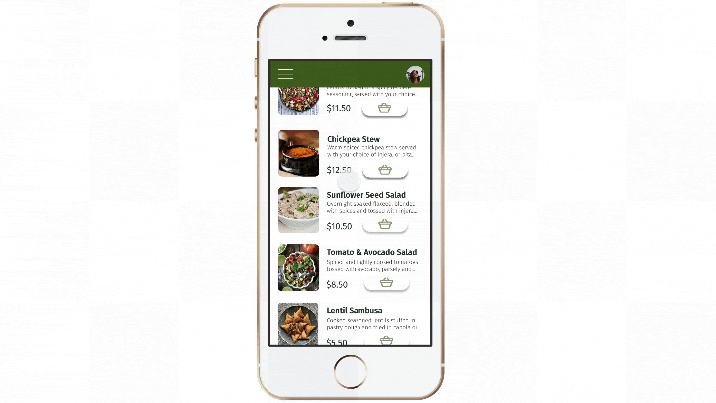
Following the usability test, the new designs focused on the ease of the order function. Thus a menu button was inserted at the top of the main page, followed by recommended orders. The color green was selected as it represents health and growth in Ethiopian culture.
Before first usability study.


After first usability study.
Following the second study, changes were made to the primary colour of the app as it was not accessible. Additionally, users were confused on how to select an item, therefore the images and title were also made clickable.
Before second usability study.


After second usability study.
Key Mockups


Following the second study, changes were made to the primary colour of the app as it was not accessible. Additionally, users were confused on how to select an item, therefore the images and title were also made clickable.
High Fidelity Prototype
The revised high fidelity prototype addresses users readability concerns.. Additionally, users have different methods of adding an item to their cart. Lastly, once an item is added to the cart users have the choice to “add items” and continue browsing.
View the Mesob App, hi-fi prototype.
App Name
When iterating on an app name, I wanted to ensure that it was reflective of the culture and history behind the food. The name Mesob was selected because it echoed back to traditional Ethiopia, yet is still a practice held to this day. In traditional Ethiopian homes, food is communal and intimate. Family members and close friends sit on stools surrounding a woven basket that can stand up to 1 metre tall. The basket has a lid, and when lifted, there is a platter of delicious food waiting to be consumed. Dining is an intentional practice, and I wanted to ensure that the design and food presented within the app feel as important.
Accessibility Considerations
I toned down the brightness of the green from early iterations to be more readable.
Icons were added alongside clickable images and text for clarity.
Order images expand when selected so users can better visualize items.
Key Takeaways
The purpose of Mesob App is to provide Ethiopian food to a wider audience in a more approachable setting. It’s applicable for those trying Ethiopian food for the first time, and those who grew up eating it.
Feedback from second usability test
“Every button did what it said it would do and was located where I thought it would be."
An key lesson I learned, was to consider the products like-ability as well as ensuring that it serves its main purpose. During a usability test, a participant shared that the ‘app wants me to order rather than discover.’ This was eye opening for me because I want the user to enjoy my design and not feel pressured to take an action.
Next Steps
Conduct a usability study to ensure that previous pain points have been taken into consideration.
Add more accessibility indicators such as text to speech.